BAUHAUS ART 1
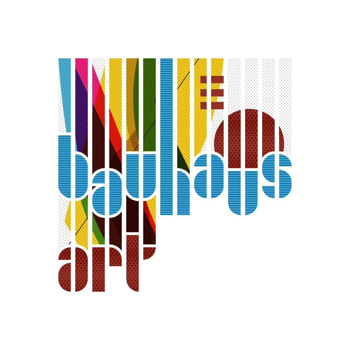
Exploiting the vertical slices inherent in Joost Schmidt’s Joschmi font, I chose to emphasize the font’s personality by vertically offsetting each character individually along vertical stripes of light gray bands. A graded dot pattern was placed atop and set to overlay layer mode to add a dimensional colour texture to the bands and characters. While the elements themselves are remnants of the 1920s, the overall look does inspire a contemporary feel.

BAUHAUS ART 2
Composing with the typically geometric patterns, shapes, overlaps and forms of the Bauhaus style, I integrated the Joschmi characters, using a light blue horizontal line pattern for BAUHAUS and a dark graded dot pattern overlaid atop ART characters. A fat white outline contours the typography to punch it froward from the background.

BAUHAUS ART 3
By essentially using the same design composition used in BAUHAUS 2, I felt that vertical stripes varying in height according to character positions would serve aesthetically as a mask for the Bauhaus-styled background. The red dome in the right-upper corner was integrated to evoke a World Fair or exhibition and was set with a red graded dot pattern matching the opposing ART characters.

YACHTING ART
A slight variation of BAUHAUS ART 3, I visualized a regatta race formed by overlaying shapes restyled into rushing sails tussling for the lead. The lone Viking-like sail (or jellyfish?) balances with the opposing ART characters overlaid with the same dark-blue graded dot pattern.


